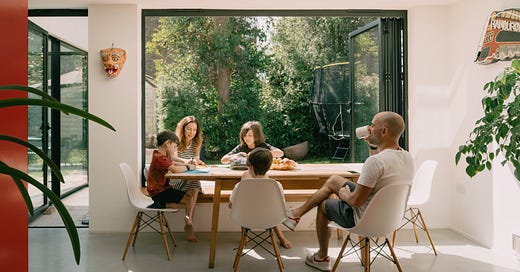
See inside the playful home of Pip & Posy TV producer Vici King
With primary-colour accents and clever details, there are plenty of ideas to steal from this vibrant family home
“The previously fragmented layout, with its series of dark and small rooms, is now a playful and bright sequence of spaces, perfect for a game of tag or hide-and-seek and providing endless variations for everyday family life.”
With a hectic schedule and three growing boys, TV producer Vici King and husband Leo desperately wanted to transform their dated three-storey detached property in London into a free-flowing space that was more compatible with family life. We spoke to the architect behind the project, Davide di Martino of Unagru Architecture Urbanism.
What was Vici and Leo’s brief?
They’re a busy family of five with three lively boys and a cat, who wanted a home that reflects their joyful personalities. With the children growing up fast they desperately needed more usable space, so we had to extend further into the roof at loft level to incorporate two additional bedrooms and completely redesign the ground and first floors.

What were the biggest design challenges?
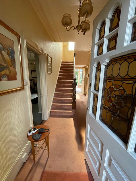
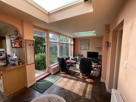
The house was built at the beginning of the 20th century and extended in 1985, albeit badly. Although it had generous proportions, the ground floor was fragmented into a myriad of rooms, some of which were small and dark. The extension was poorly built and had added a narrow corridor-like space across the back of the building that was hardly usable. Perhaps the worst aspect was the lack of clarity: there were several dead ends that made it feel like living in a maze with way too many doors, meaning the family spent a lot of time apart.
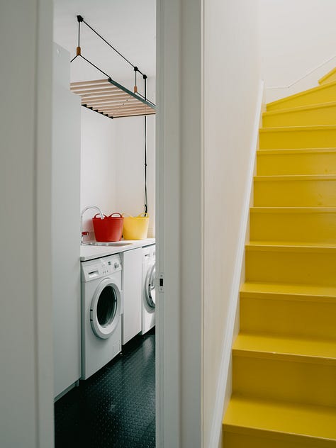
Like the rest of the house, the finishes were very tired, and all the systems needed upgrading, plus there was no utility room. On the outside, the property was a mix of finishes: pebbledash, red brick, modern tiles, black and white guttering and several UPVC windows that didn’t do justice to the original building.

How have you transformed the layout?
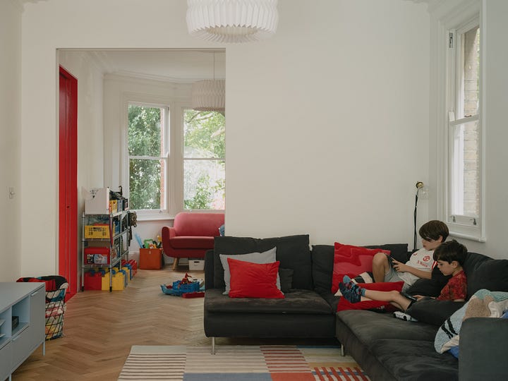
We put the staircase and cloakroom at the centre of the plan with a series of open rooms leading off it. All the spaces are connected and yet there’s still an element of surprise – the large openings between the rooms are not always aligned (like in the Mies van der Rohe’s Krefeld houses), increasing the sense of intrigue as you move through the ground floor.
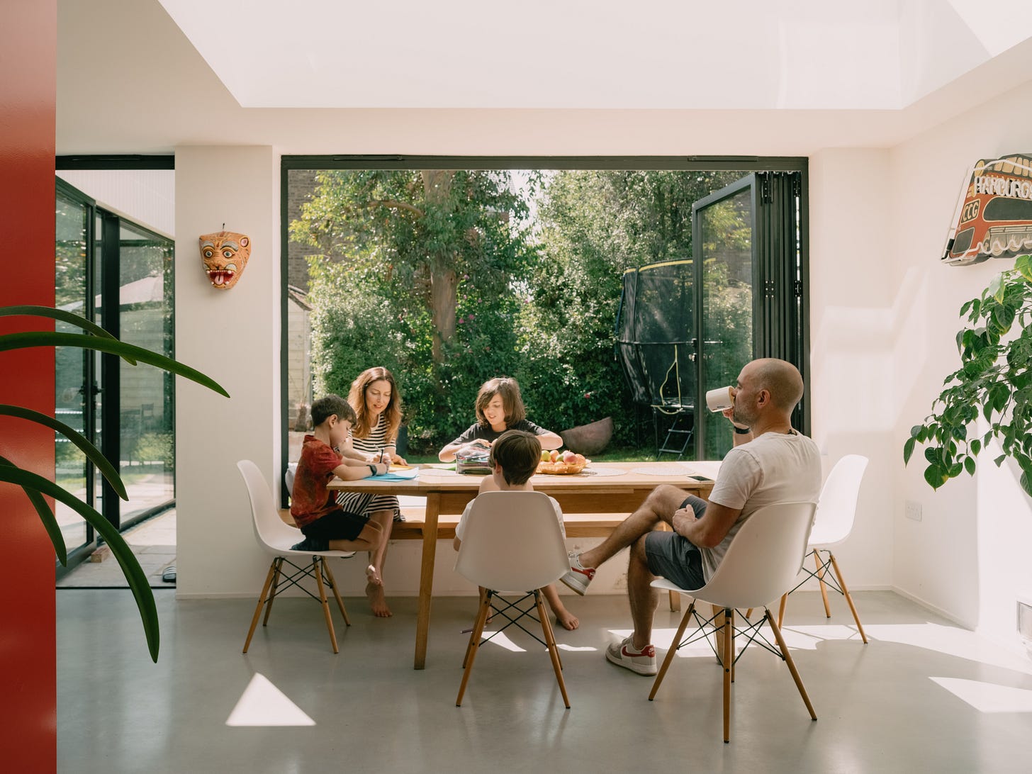
The existing kitchen and dining area were previously in the rear extension with limited access to natural light, with wall spaces occupied by cabinets. We moved the kitchen to the front of the property, in a room with perfect proportions. This freed up the back of the house, which has now become entirely open to the garden.
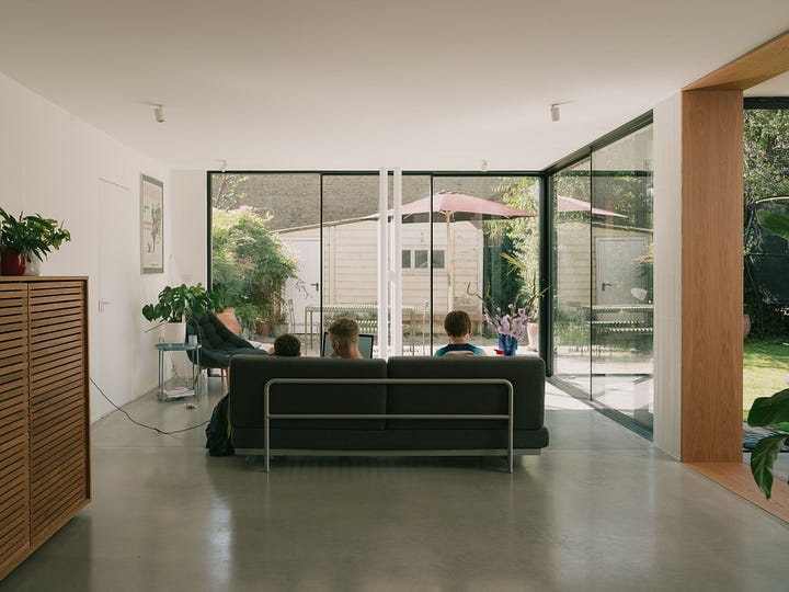
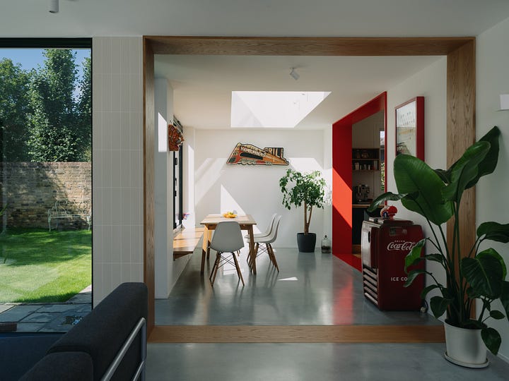
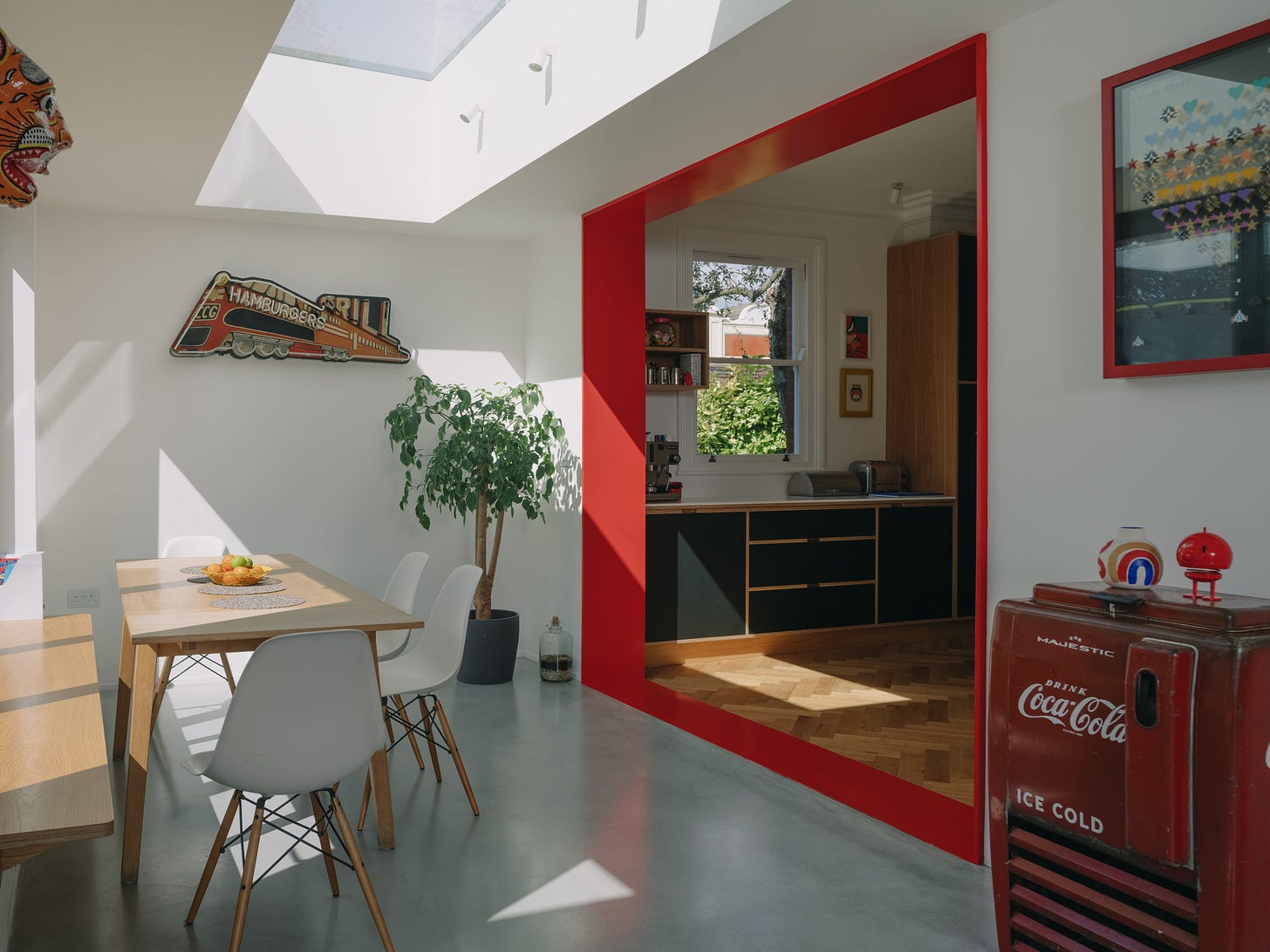
We embraced the opportunity to treat the dining area as an indoor/outdoor space, ideally placed between the kitchen and the living room. We introduced bench seating on one side to make the most of the relatively narrow space, even more so because we wanted to preserve the circulation space of the loop. The bi-fold doors combined with the exterior bench blur the boundary between exterior and interior, as well as providing a more playful way of jumping in and out of the house.
How is the home better equipped for family life?
To create a sense of fluidity and to allow everyone to be together in one space, there are no corridors or closed solid doors, only sliding pocket doors, which are mostly left open. The TV room/snug doors can be shut when the family is watching films together and the children sometimes close the door between their playroom and the kitchen or the snug room when they want to make more noise or play the piano. The kitchen can also be isolated from the entrance hall to avoid smells travelling up to the bedrooms.

What was the inspiration behind the bold accent colours?
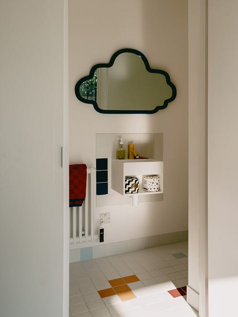
As the house is a series of semi-open rooms, each with its own character, we wanted to highlight the difference between the spaces and to show the importance of the original structure. From the outset, we decided that these thresholds would be finished to highlight their presence, and initially, we had proposed oak. However, Vici, Leo and the boys demanded that the house be more playful and chose bold primary hues. I was initially worried the red would be too bright, but I was gladly proven wrong! The family’s love of colour can clearly be seen throughout the home – the bright-blue staircase is an eye-catching statement as soon as you walk through the door, with a second yellow staircase and primary accents running throughout the property. It’s such a fun family home that’s a joy to spend time in.
Would you be this daring with colour in your home? We’d love to hear what you think about this project in the comments below.
Join our Substack chat
Are you currently renovating your home, or considering taking on a project? However big or small, we’re here to help you get your project off the ground. We’re launching a monthly design clinic over on our Substack chat where you can share your family reno dilemmas and we’ll aim to get your questions answered. Download the Substack app and join our chat by clicking on the link below.

